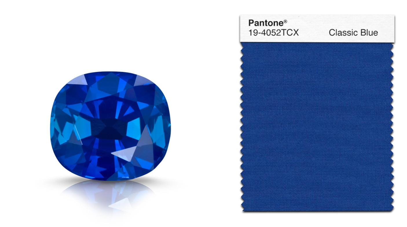
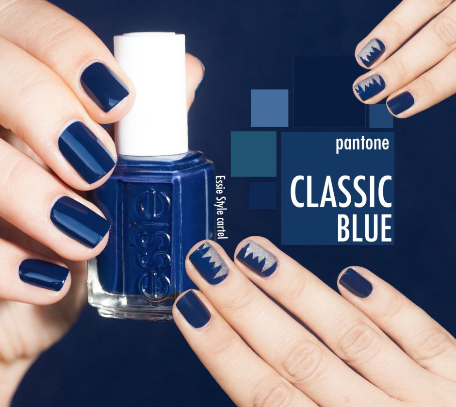
自從2000年開始,色彩權威Pantone彩通都會根據社會局勢、趨勢分析,收集資料並公布出名年最具影響力的代表色。12月5日,Pantone公布了2020代表色─由色票號碼為19-4052的「Classic Blue經典藍」脫穎而出。
跨越2020年,正是代表一個十年的結束與開始,在面對如今節奏快速、高壓的世界裡,「經典藍」為人類心靈帶來平和與安寧,有助於專心與重新集中思緒,挑戰我們加深思考、拓展視野,並敞開心胸溝通交流、孕育恢復力。
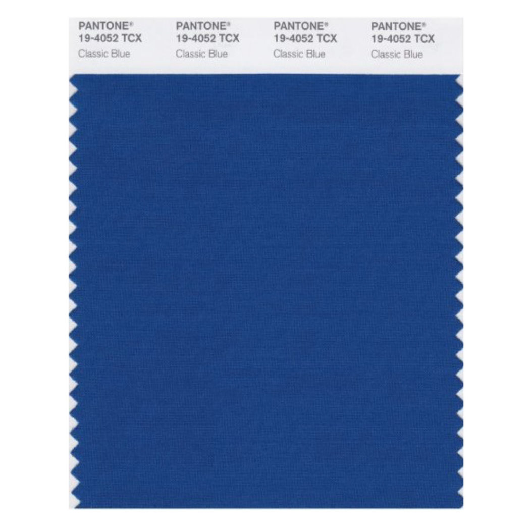
▲圖源/Pantone彩通
「經典藍」並不代表著悲傷,跳脫過去幾個世紀以來,藝術家與作家大多愛用「藍色」代表憂鬱,但如今這個世代已經不會再把藍色與悲傷聯繫起來,重新為「藍色」賦予新的意義與生命。
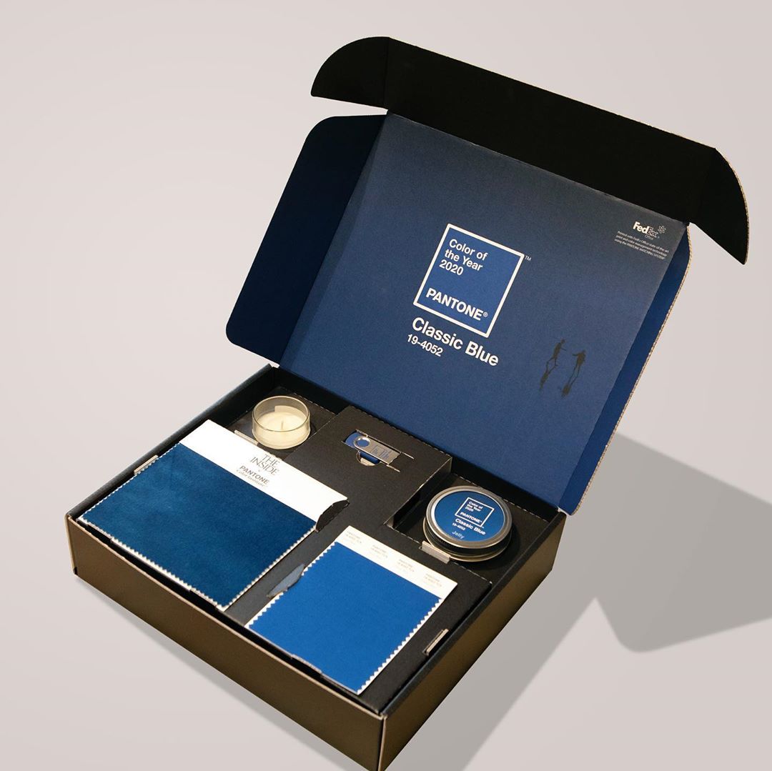
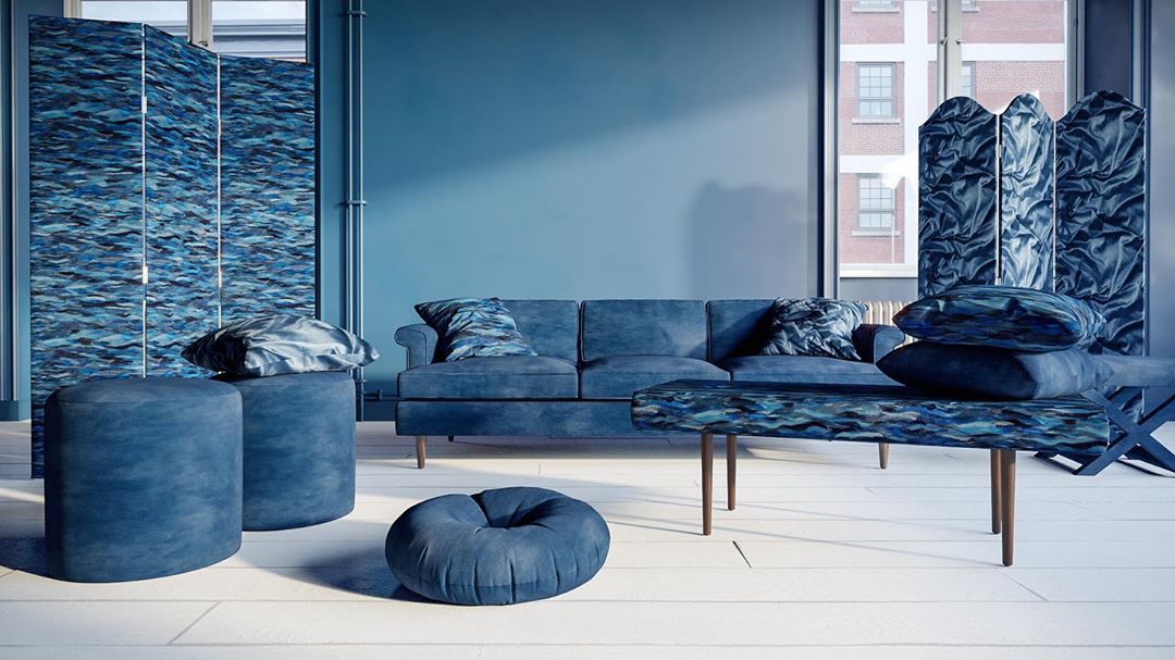
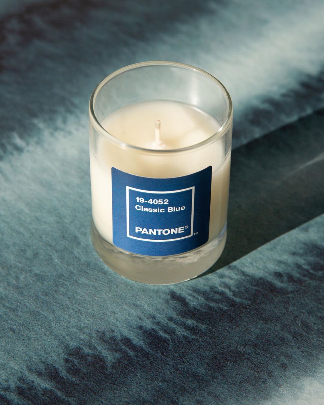
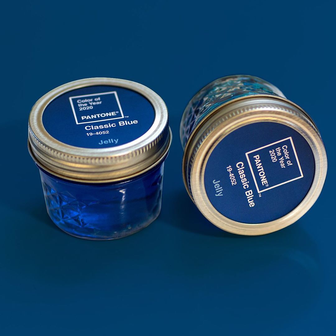
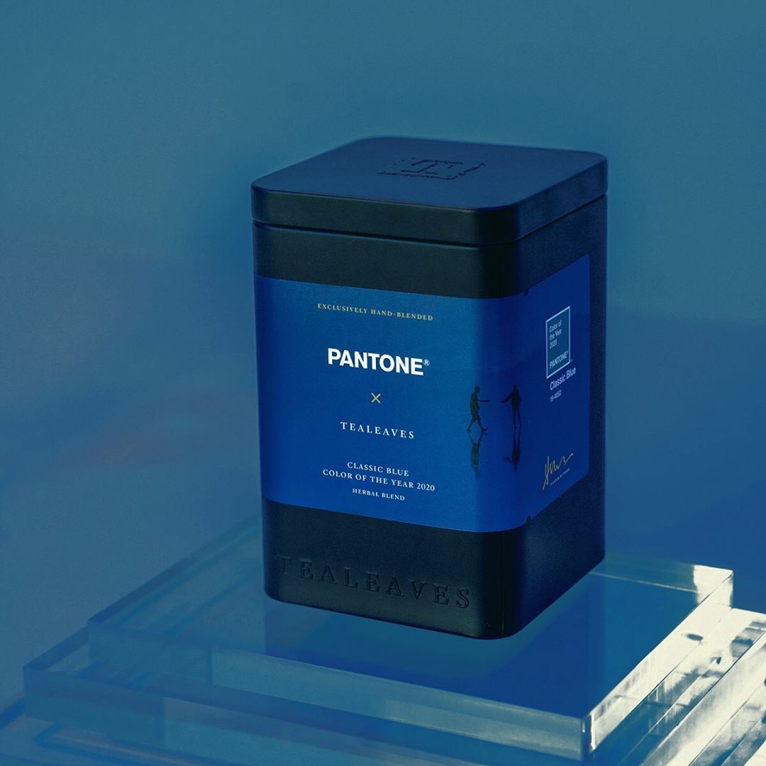
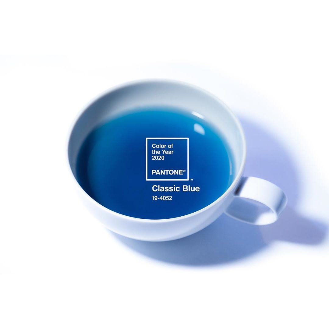
為了讓「Classic Blue經典藍」的真正涵義能完全地融入生活中,Pantone彩通今年首度採用多重感官體驗來重新詮釋這個色彩。延伸「Classic Blue經典藍」的感官觸角,透過視覺、聲音、口感、氣味及觸覺等多元演繹來呈現;包括與Audio UX音頻品牌公司、LANDR音樂人創意平台FEDEX OFFICE(聯邦快遞)、ARTECHOUSE數位互動藝術空間、Adobe Stock圖庫公司、Firmenich香精香料公司 、The Inside網路家居擺設品牌、TEALEAVES調配茶品牌一同合作,啟發創作者與消費者以不同的角度看待色彩,藉此發掘新的模式與聯想,鼓勵大家創造出更多新體驗與驚豔。
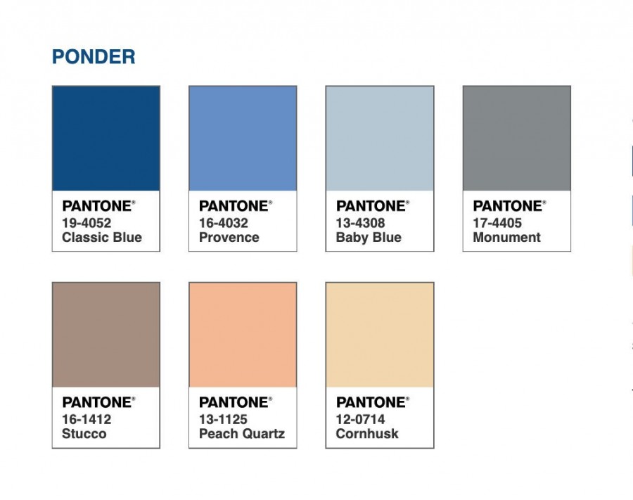
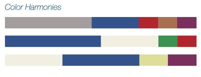
「Classic Blue經典藍」推薦搭配色
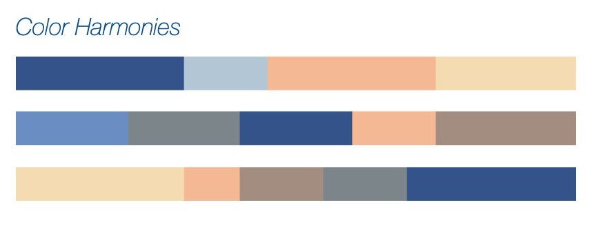
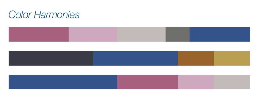
1. Ponder沉思
冷藍色調與相對溫暖撫慰的色調搭配,使具深思冥想的「Classic Blue經典藍」誘發出舒緩冷靜的效果,讓人心靈更加寧靜祥和。
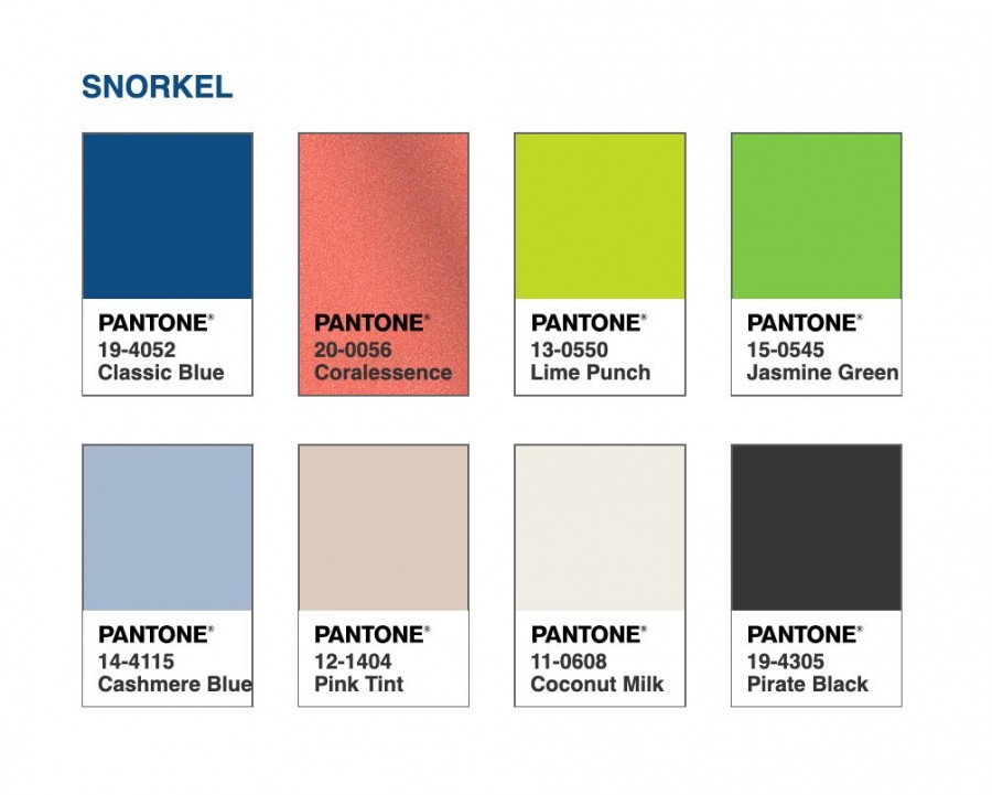
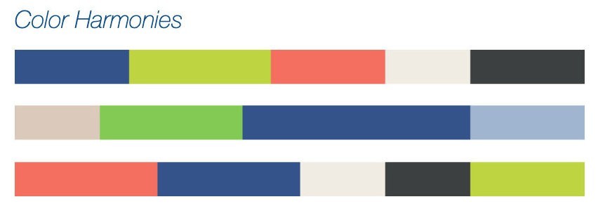
2. Snorkel潛水
「潛水」讓我們聯想到快樂、活潑明豔的熱帶天堂,加入經典的黑色與白色;將低調沉穩「Classic Blue經典藍」構成更戲劇化的對比。
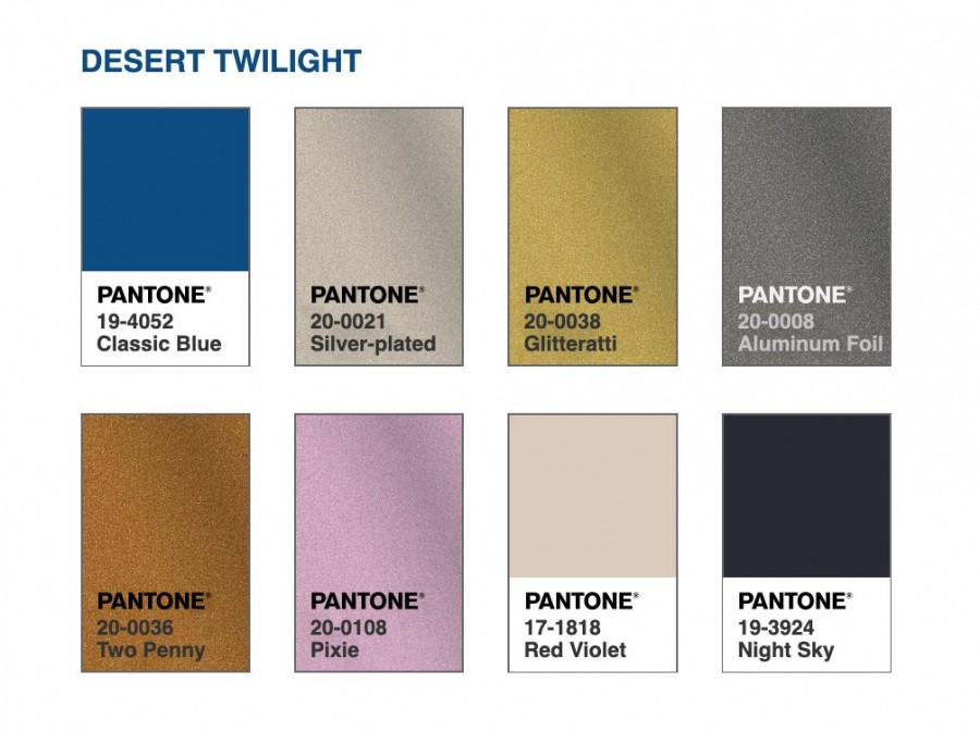
 3. Desert twilight沙漠薄暮
一望無垠的「Classic Blue經典藍」令人聯想到黃昏初始的天空,在優雅的背景中襯托出閃閃發光的成熟色調揮灑過天際,為「沙漠薄暮」增添光亮的火花。
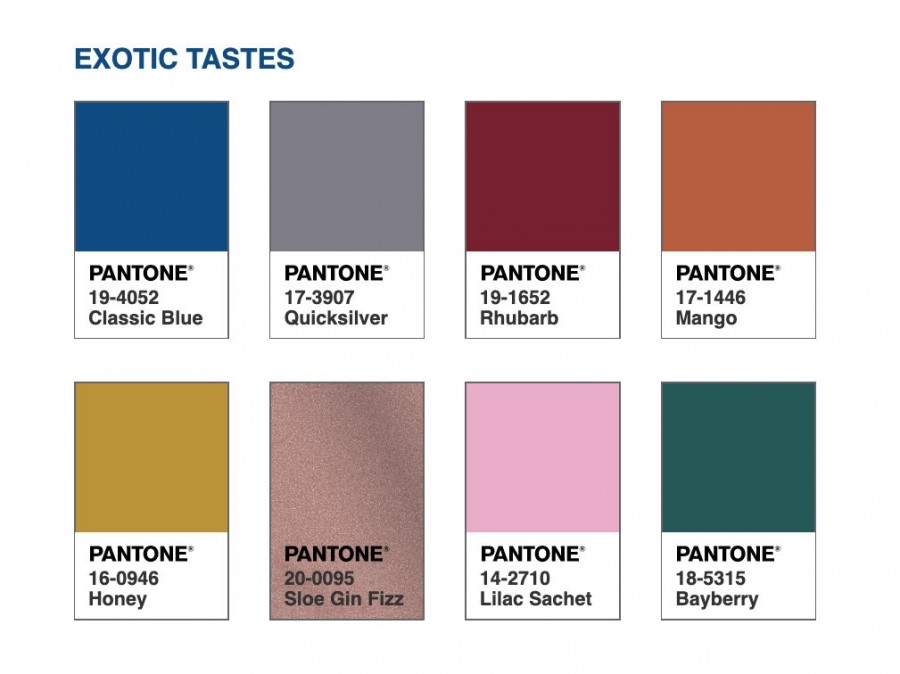
4. Exotic tastes異國風味
此色彩組合反映出自然佐料、調味以及藍色食物,味道與色彩大膽且迷人的混合。近似「Classic Blue經典藍」的藍色食物大多富含花青素,藍色食物有助打造一個堅固的基礎,用以維護良好的健康。
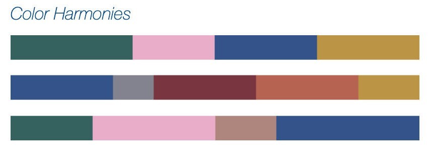
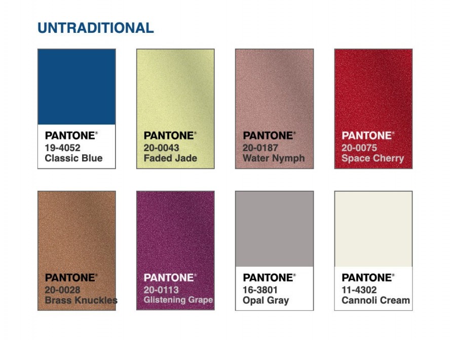
5. Untraditional傳統之外
將「Classic Blue經典藍」設定為打底的色調,搭配上其他與眾不同且炫目的風格色彩,十分吸睛且具特色。
「Classic Blue經典藍」的流行時尚
●衣服設計
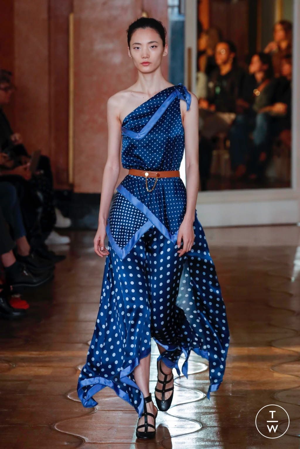
▲圖源/ Pinterest Aysha Corrêa Consultoria de Estilo
●室內設計
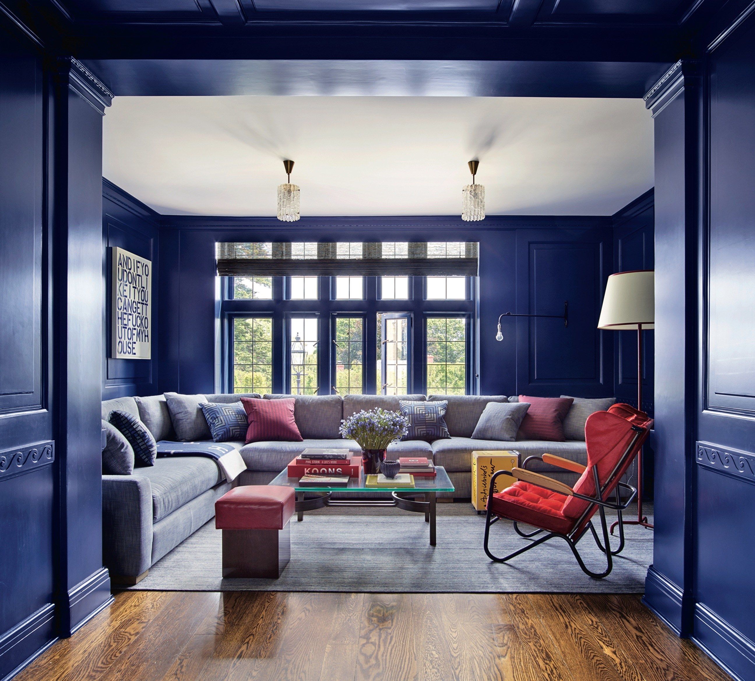
▲圖源/ Pinterest Erik Lemus Realtor at Keller Williams Realty CADRE# 01963340
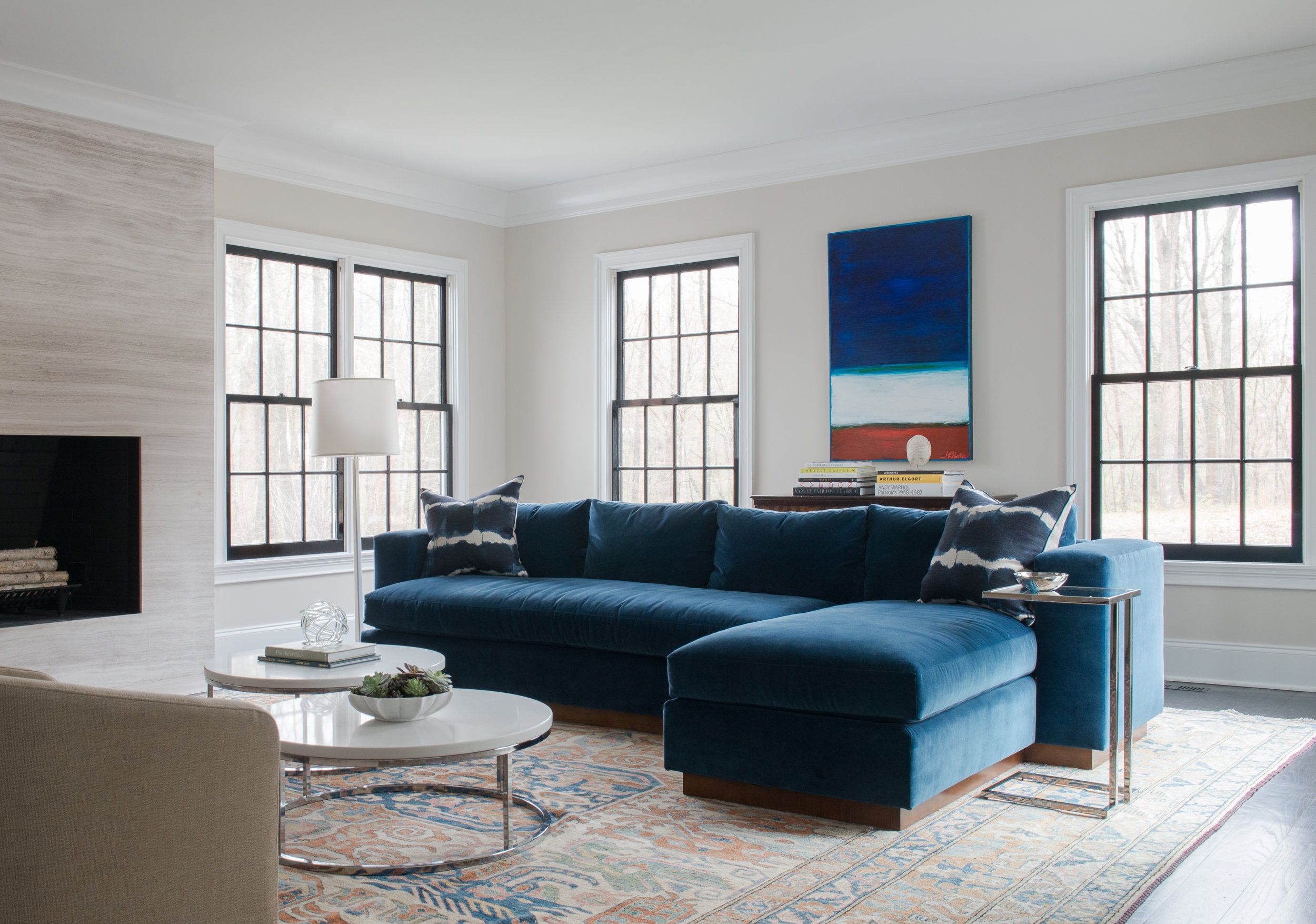
▲圖源/ Pinterest Cobalt + Gold
●珠寶設計
▲圖源 截取自/ Pinterest GIA
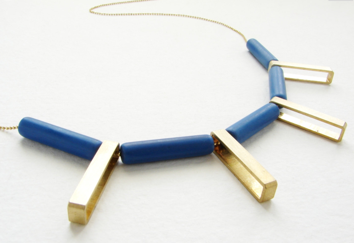
▲圖源 截取自/ Pinterest Necklace Day
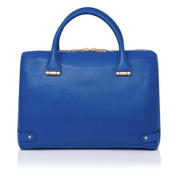
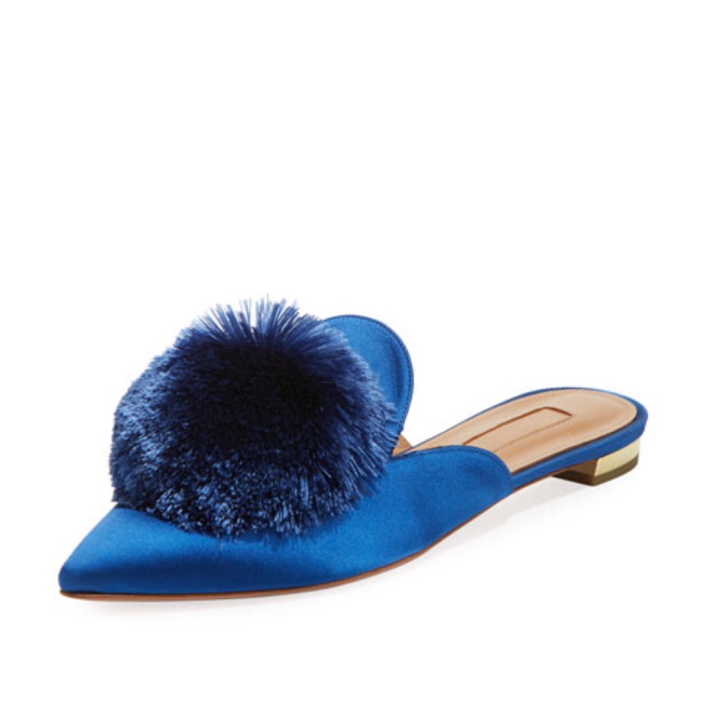
●單品設計
▲圖源/ Pinterest Lady Basil's Inspiring Colors /Reyhan S.D. (3)
 ▲圖源/ Pinterest The Poshmark App
 ▲圖源/ Pinterest kelsi
Pantone的年度代表色(~2015)
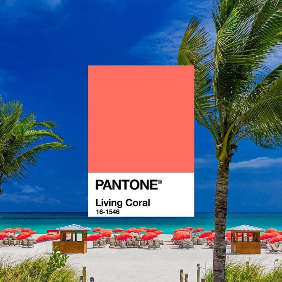
●2019「活珊瑚橘 Living Coral」
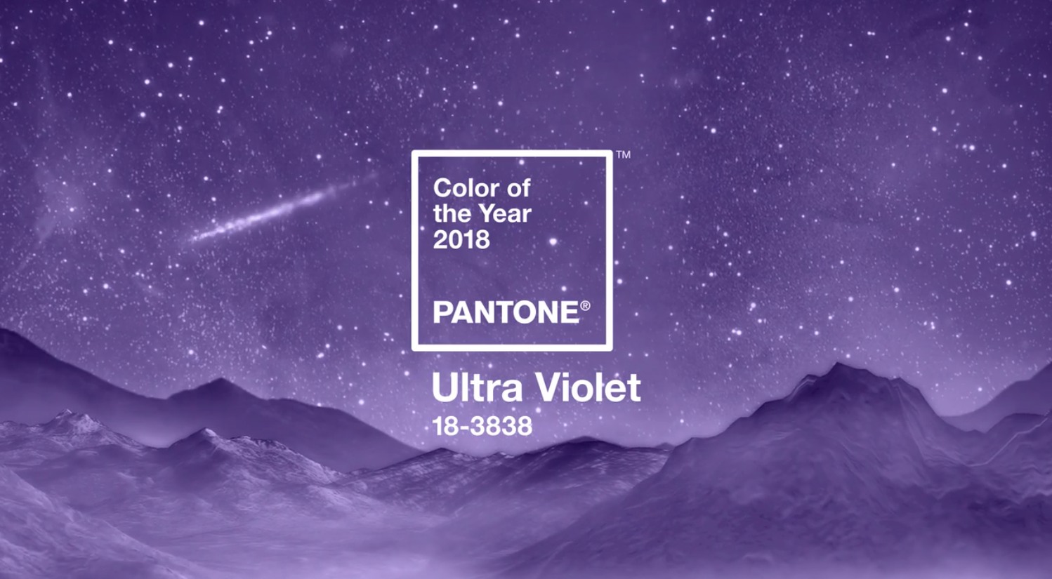
●2018 「紫外光色Ultra Violet」
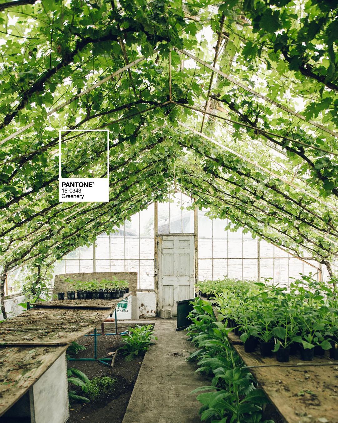
●2017 「草木綠Greenery」
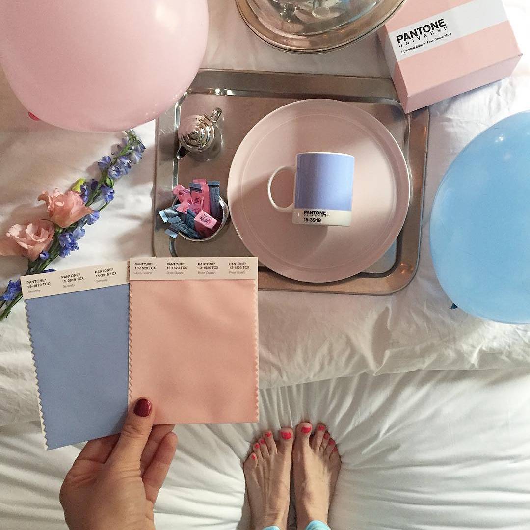
●2016「玫瑰石英粉紅與寧靜粉藍Rose Quartz & Serenity」
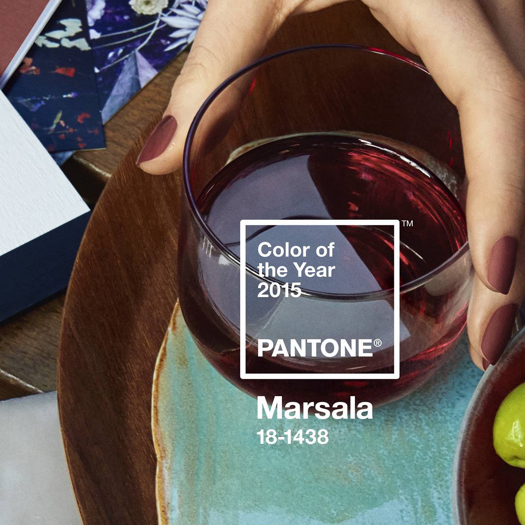
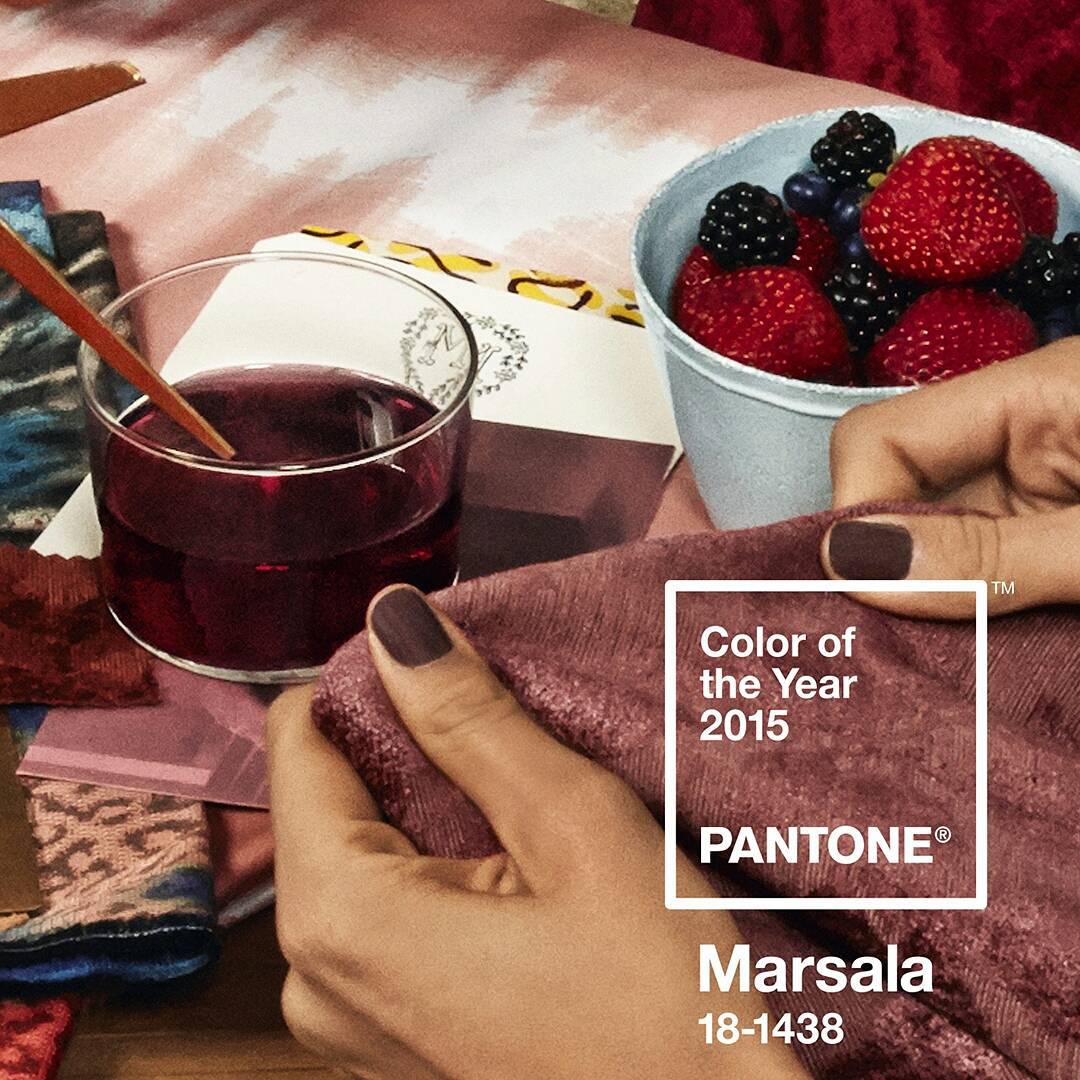
●2015「瑪薩拉酒紅Marsala」
世界的步調隨著資訊、科技的發達越變越快,雖為我們帶來了便利與效率,但也同時為心靈帶來了焦躁以及不踏實之感。希冀未來能跟著「Classic Blue經典藍」重拾平穩、自信與寧靜,用期許迎來廣闊蔚藍的心情,開啟嶄新的十年。
圖源、首圖/Pantone彩通